Culturally Nourishing Schooling
Web Design
Problem Statement
The Culturally Nourishing Schooling (CNS) website lacked a clear brand identity and contained limited information, making it challenging for users to engage with the organisation and understand its mission. This called for a more engaging, user-friendly design that would enhance content accessibility and better communicate CNS’s values and initiatives.
Project Summary
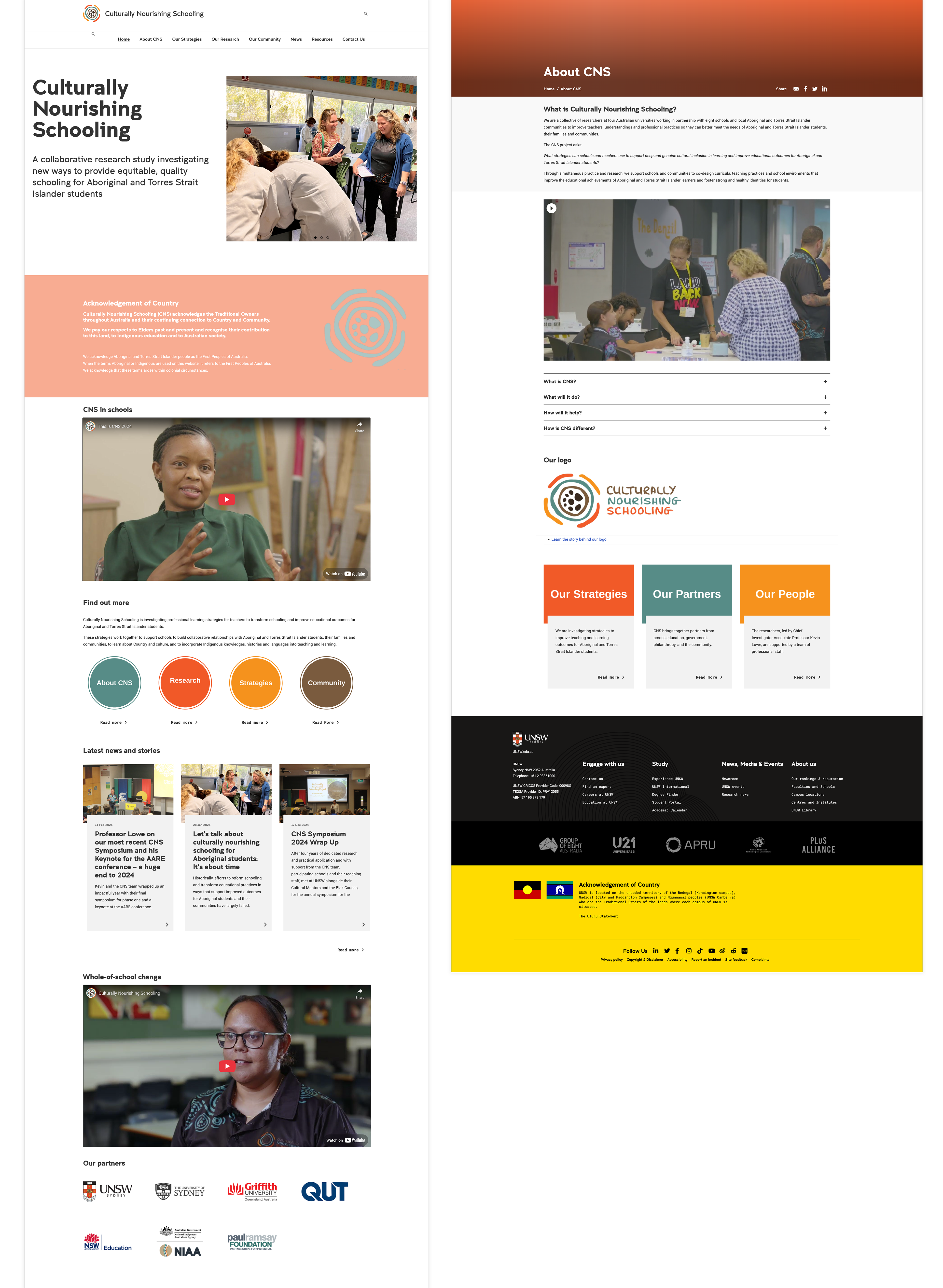
Designed and edited the website for CNS, ensuring it effectively communicated the organisation's mission and initiatives. The project involved creating a visually engaging and user-friendly platform that aligns with CNS’s branding and values.
Role
UX design, research, and prototypes.
Project Duration
5 months
Goals
Clarify the Project’s Mission
To ensure that CNS’s core purpose and values were clearly communicated and easily understood by users, making it the focal point of the website.
Enhance User Experience
To improve navigation and usability, ensuring that users could easily find information, particularly school profiles, and engage with the content effortlessly.
Reflect Program Expansion
To design a flexible platform that could accommodate the growing number of schools and initiatives, while maintaining a clean and structured layout.
Create a Visually Engaging Platform
To use visuals, such as photos and graphics, to make the website more engaging and reflective of CNS’s mission, creating a visually immersive and interactive experience.
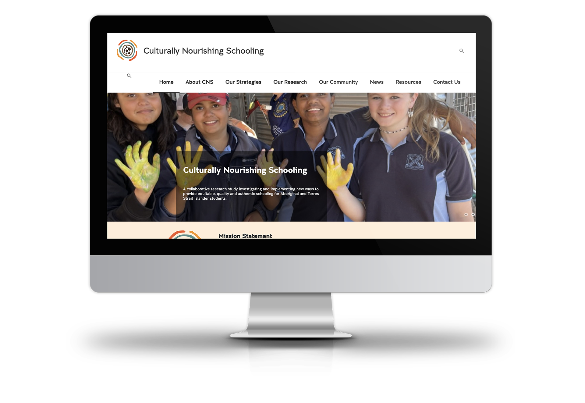
How it used to look
Design Process
Initial Explorations
The CNS website struggled with a lack of clarity around its core message, with the main purpose of the project—highlighting the mission and educational offerings—being completely lost. The information was cluttered, and as the program was expanding, there was a need for a clearer, more focused design that would convey the project's vision effectively while making content more accessible.
Iterations & FeedbackThe CNS website struggled with a lack of clarity around its core message, with the main purpose of the project—highlighting the mission and educational offerings—being completely lost. The information was cluttered, and as the program was expanding, there was a need for a clearer, more focused design that would convey the project's vision effectively while making content more accessible.
Early feedback revealed that the core mission of CNS needed to be more prominent and clearly communicated. In response, I restructured the website to emphasise the key messages and streamlined the content layout, ensuring that the purpose of the project was front and centre, while accommodating the program's expansion and improving user navigation.
Feature Breakdown
Clear Mission Focus
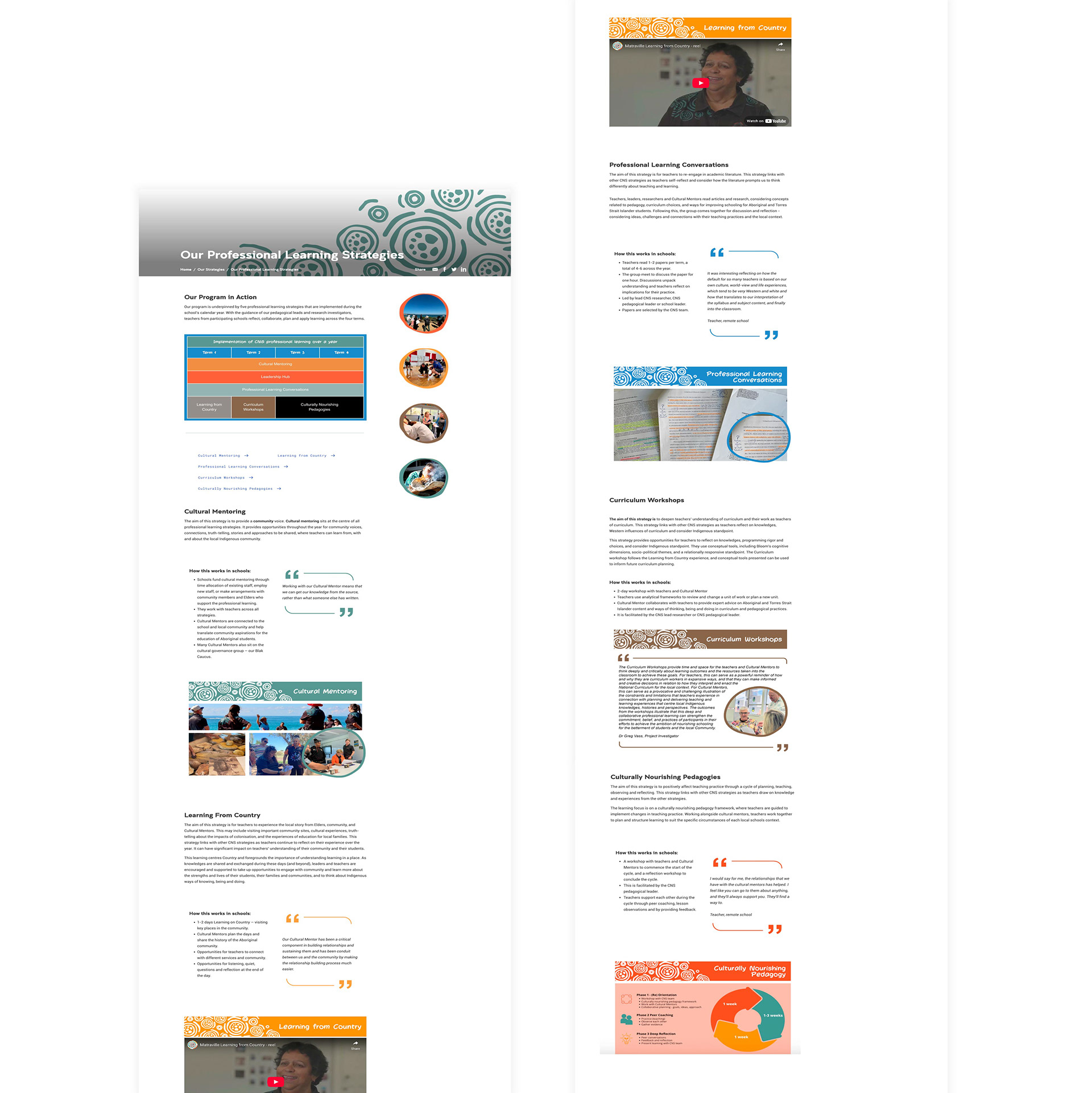
I prioritised showcasing CNS’s core values and educational offerings through a more prominent, well-structured homepage and navigation, ensuring users could easily understand the project’s purpose.
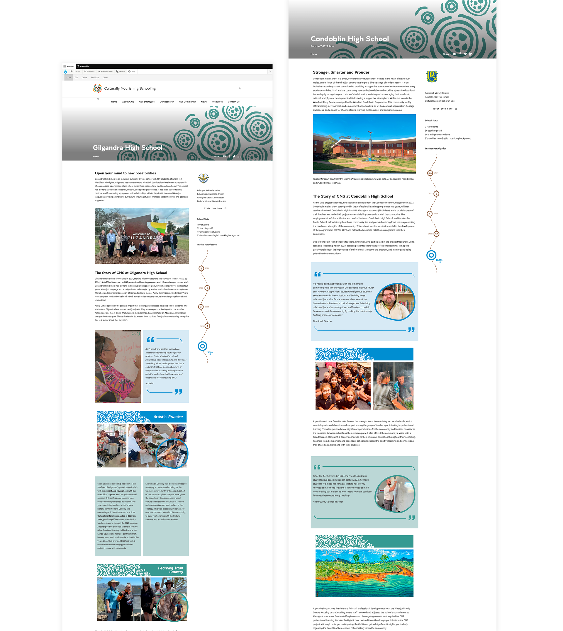
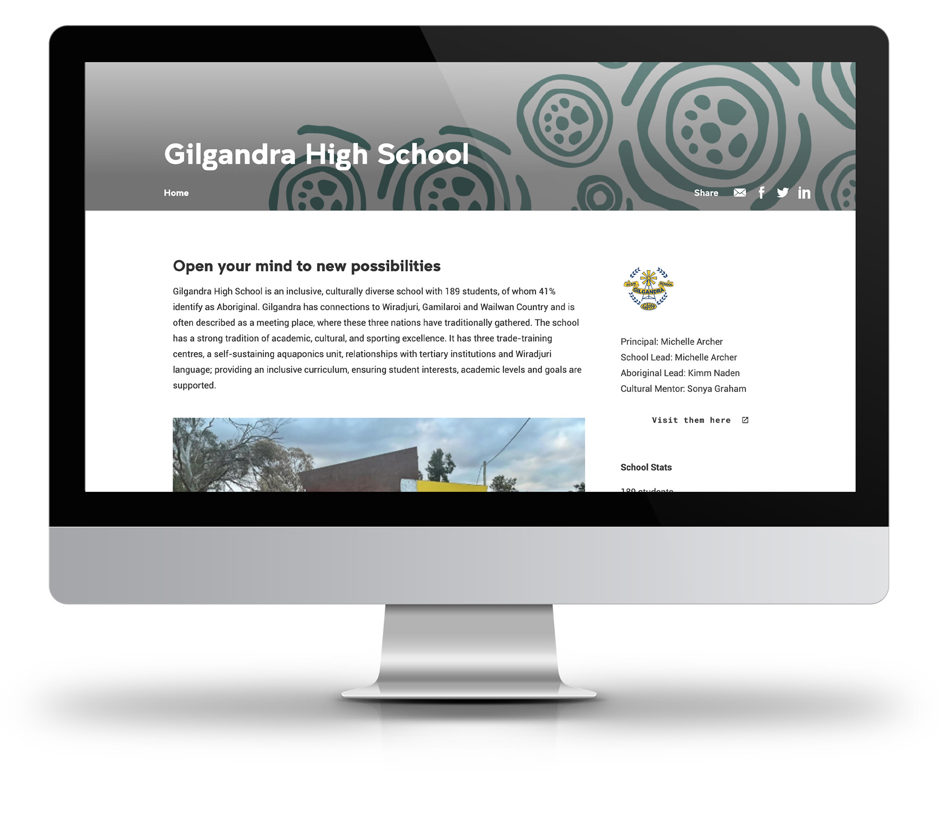
School Profile Organisation
I introduced a dedicated, visually rich section for school profiles, using large, high-quality photos of each school paired with concise, easy-to-read information. This helped users easily browse and explore the expanding network of schools, with each profile highlighted by vibrant imagery that complemented the content.
Improved Navigation & Usability
I streamlined the layout with large, clearly defined buttons and high-impact visuals to guide users through the site. I also incorporated dynamic image galleries and easy-to-navigate menus, making it simple for users to locate relevant content quickly while keeping the design clean and visually appealing.
Responsive Design
The website was designed to be fully responsive, ensuring that all images and visuals were optimised for both desktop and mobile devices. This provided a seamless experience for users regardless of the device they were using, maintaining a high level of visual engagement across all screen sizes.
________________________________________
Results
The website has become a key platform for outreach, presentations, training, and onboarding—now a trusted resource that helps managers present confidently and onboard schools with ease. Improvements included a clearer structure, enhanced visuals, and a stronger overall brand presence.